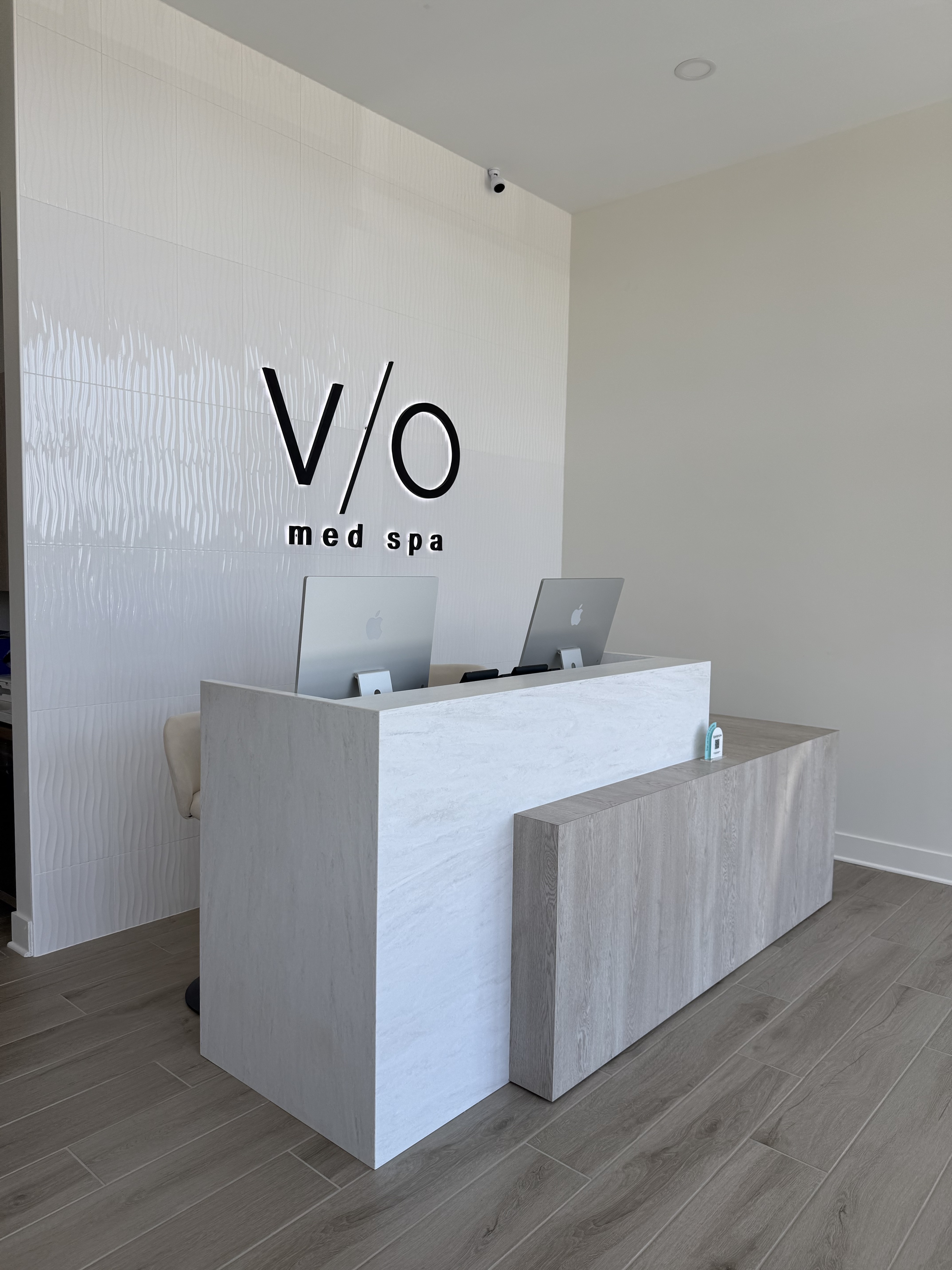
Reception, current build. Glossy textured feature tile behind the V/O mark, white marble desk face with warm gray wood-grain accent panel, and warm plank flooring. Current specification is shown.
A client decides whether they belong here in the first few seconds, before a word is exchanged. The interior is where the voice becomes architecture: calm, modern, clinically credible, and warm enough that no one feels they have to earn their place in it.
The interior carries the same standard as the voice. It should feel professional without feeling sterile, and elevated without feeling exclusive. The look is hospitality-forward comfort inside a clinical setting, held to one system so a client recognizes VIO in any market.
Warm neutrals on the large surfaces, contrast carried by texture rather than color. The room is quiet on purpose.
It reads as a medical environment you can trust, without the cold, fluorescent feel of a clinic.
Required finishes and lighting logic hold across every location. The consistency is what builds trust before the consultation.
Nothing decorative for its own sake. Each material and fixture earns its place, or it is cut.
The 2026 specification leads with a soft off-white across walls and trim, anchored by Iron Ore in the restrooms and carried by warm wood and travertine tones. Paint values are exact; material tones are representative, and physical samples always govern the final selection.
Grout: Custom #183 Chateau; wall-tile grout Laticrete Permacolor TEC 912 Optic White. Schluter Joy 7/16″ J110MBW edge trim.
The selections that changed in the 2026 update, in one place. This is the spine of the build; everything else coordinates to it.
| Surface | Specification | Replaces |
|---|---|---|
| Countertops | WilsonArt Solid Surface Beige Travertine 9236SS | Angel Falls |
| Cabinetry | WilsonArt HD Laminate Ashbee Oak 17000K-57 | Morris Oak |
| Floor tile | Calgary CG41 Fawn Tile 12x24, stone-look porcelain | Platinum Vintage |
| Logo & bath tile | Frieze White Glossy 12x24, CTIFRWHFLOWG | — |
| Walls | SW 7008 Alabaster, matte trim & doors semi-gloss | — |
| Restroom upper | SW 7069 Iron Ore, matte | — |
| Hardware | Matte black throughout | Satin chrome |
Lighting does as much for the feel of a VIO as any finish. It is always warm in temperature, never harsh or cool, and built in three layers so the room has both function and atmosphere.
Recessed downlighting for even, general illumination. Warm color temperature throughout. This is the base layer that keeps the space functional and flattering.
Chandeliers and feature fixtures mark the brand moments: a linear convertible chandelier over reception, a linear fixture above the conference table, a wide chandelier in the quiet room. Limited to approved styles.
Wall sconces add depth and rhythm: a tall LED sconce running the hallway on its own dimmer, color-select sconces in the restrooms. Decorative and ambient circuits run on separate dimmers so the room can shift through the day.
A few surfaces carry the identity. They are protected: nothing competes with them, and they are never crowded.
The backlit mark on the textured feature wall, centered and visible from the entry. No competing visual elements nearby. This is the primary brand identifier in the space.
A wood-tone desk over a travertine base. Where recognition happens, so it stays uncluttered: no signage clutter, no sales rack, just a clean surface and a person who looks up.
An illuminated display set into the wall. Product is shown like it matters, not stacked to sell. Feature walls support the brand; they never overpower it.
Consistency is the product, so the core is fixed. A short list of elements can flex with written approval from the VIO design team, and only that list.
Field verification is required before fabrication. Substitutions must be reviewed and approved, and mockups may be required for custom elements. This page is direction, not construction drawings; it does not replace code requirements.
Everything online is a promise; the location is where it's kept. The brand lives in the signage, the room, the print in a client's hands, and the words spoken at every touchpoint: the same voice, made physical.
A warm wood-panel feature wall with the V/O mark is approved as a secondary logo wall treatment. Use at hallway terminations, conference rooms, and secondary reception points where the primary tile feature wall is not feasible. The mark sizing, clear space, and placement rules remain the same; only the substrate changes. Requires written approval before fabrication.
The voice isn't only written; it's spoken at every touchpoint. A few standards:
"Welcome back. How was the trip to Italy?"
"Before anything else, tell me what you're noticing and what you'd like to feel."
"Your pace, always. Want me to hold the same time with me next month?"
Left at the first visit. Warm, plain, signed by the provider.
What we did, what's next, what to expect. No jargon.
Every printed piece uses the same charcoal, cream, and bronze; serif headlines and sans body. A client should recognize VIO with the logo covered.
The test for every surface, a billboard, a homepage, a welcome card, a sentence at the desk: would a client who has been to VIO in another city recognize this as the same brand? If yes, it's working. If not, it isn't VIO yet.
A quick gut check on what belongs and what doesn't. Decide before you reveal the answer; the reasoning is the part that sticks.